BCMM New Fonts
New Fonts and a Cleaner UI – First Time Since 2001
If the UI feels cleaner and more readable than ever, that is not an accident.
For the first time since 2001, the game has received new fonts -- but more importantly, it now has a UI that is actually designed for modern displays.
This is not just a cosmetic change.
It is something the community has been asking for for years.
What's New?
To clarify upfront: Crillee remains the default font and will continue to be the only default font on UI layouts other than the widescreen layouts provided by BCMM (HD and QHD).
Two new fonts have been added:
- Okuda
- Antonio
These are not direct replacements. They are optional alternatives that can be toggled and hot-swapped in-game.
Antonio
When the Text Finally Breathes
Antonio is the font that creates that moment:
"Wait... why is this suddenly so clear?"
I intentionally scaled it larger than Crillee -- roughly equivalent to Crillee at 6pt, but without the compactness or loss of clarity.
On widescreen monitors:
- letters have more space
- shapes are cleaner
- text remains readable without strain
This is not a coincidence.
This is intentional design.
UI Logic Behind the Scenes
For larger fonts to truly work, simply changing the font was not enough.
The entire UI was:
- adapted to the new text sizes
- given offsets where needed
- manually aligned in areas using absolute positioning
- adjusted so labels sit where they belong -- clear and meaningful
In other words, the UI now understands that the text is larger -- and behaves accordingly.
Responding to Long-Standing Community Requests
If you have ever played larger mods and thought:
"Why is this so tiny?"
-- you were not alone.
Comments about font size have appeared:
- for months
- for years
- across multiple mods and setups
This update is a direct response to that feedback.
No hacks. No zooming. No "sit closer to the monitor".
Free Choice
Nothing is imposed:
- prefer the original Crillee -- it is still there
- want Star Trek style (Okuda) -- you have that option
- want maximum readability (Antonio) -- also available
The font can be switched freely, depending on what suits you best.
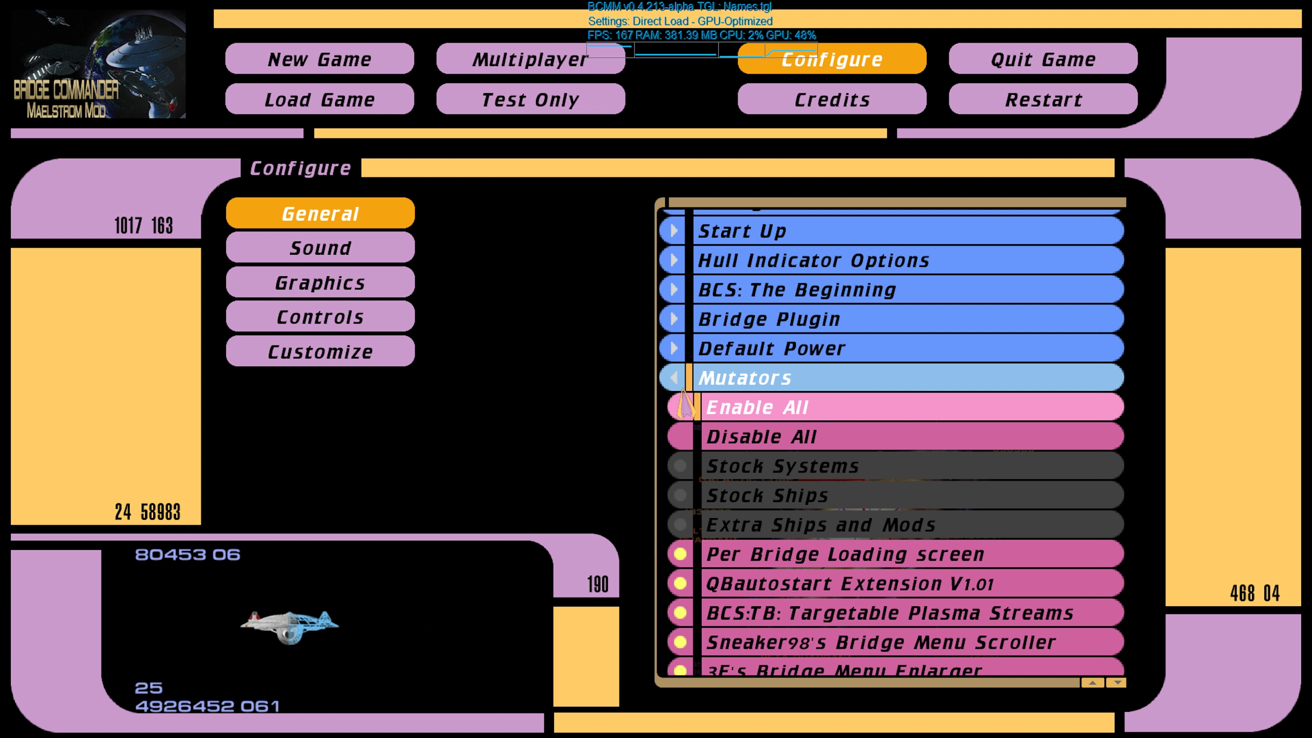
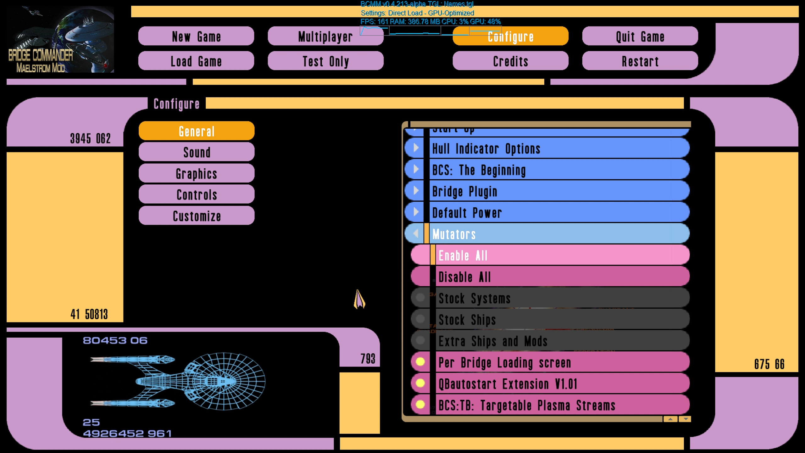
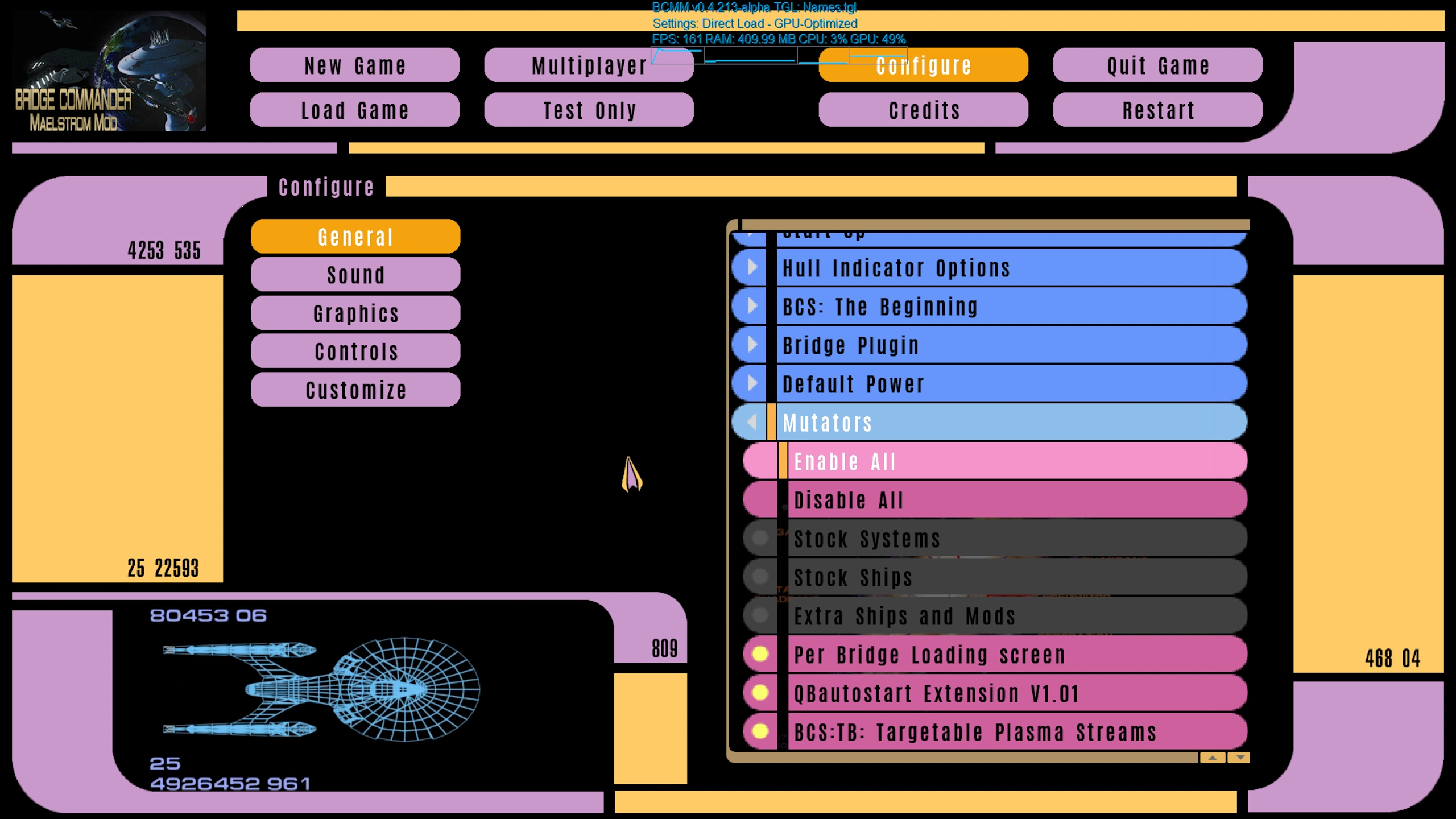
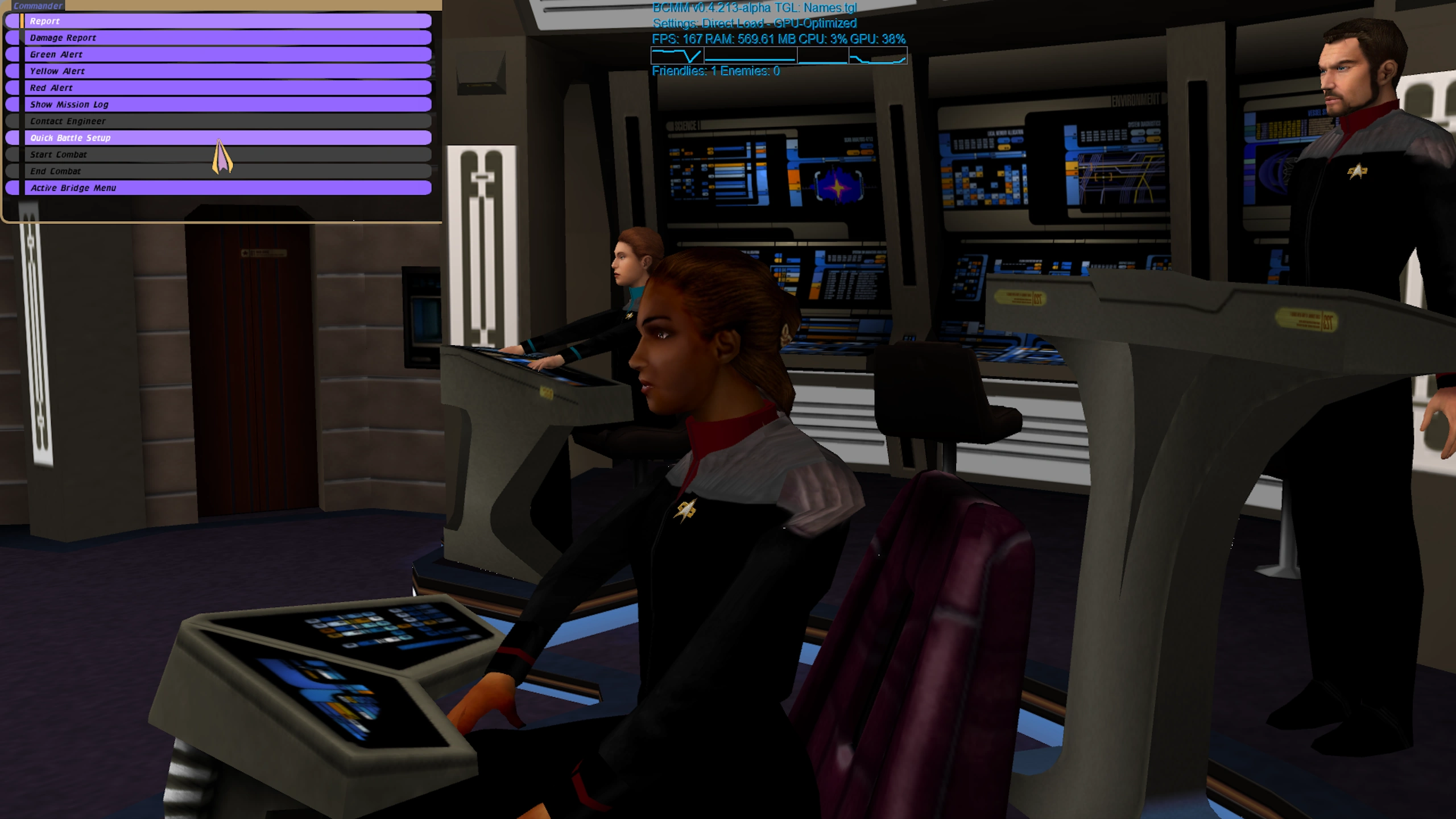
Screenshots
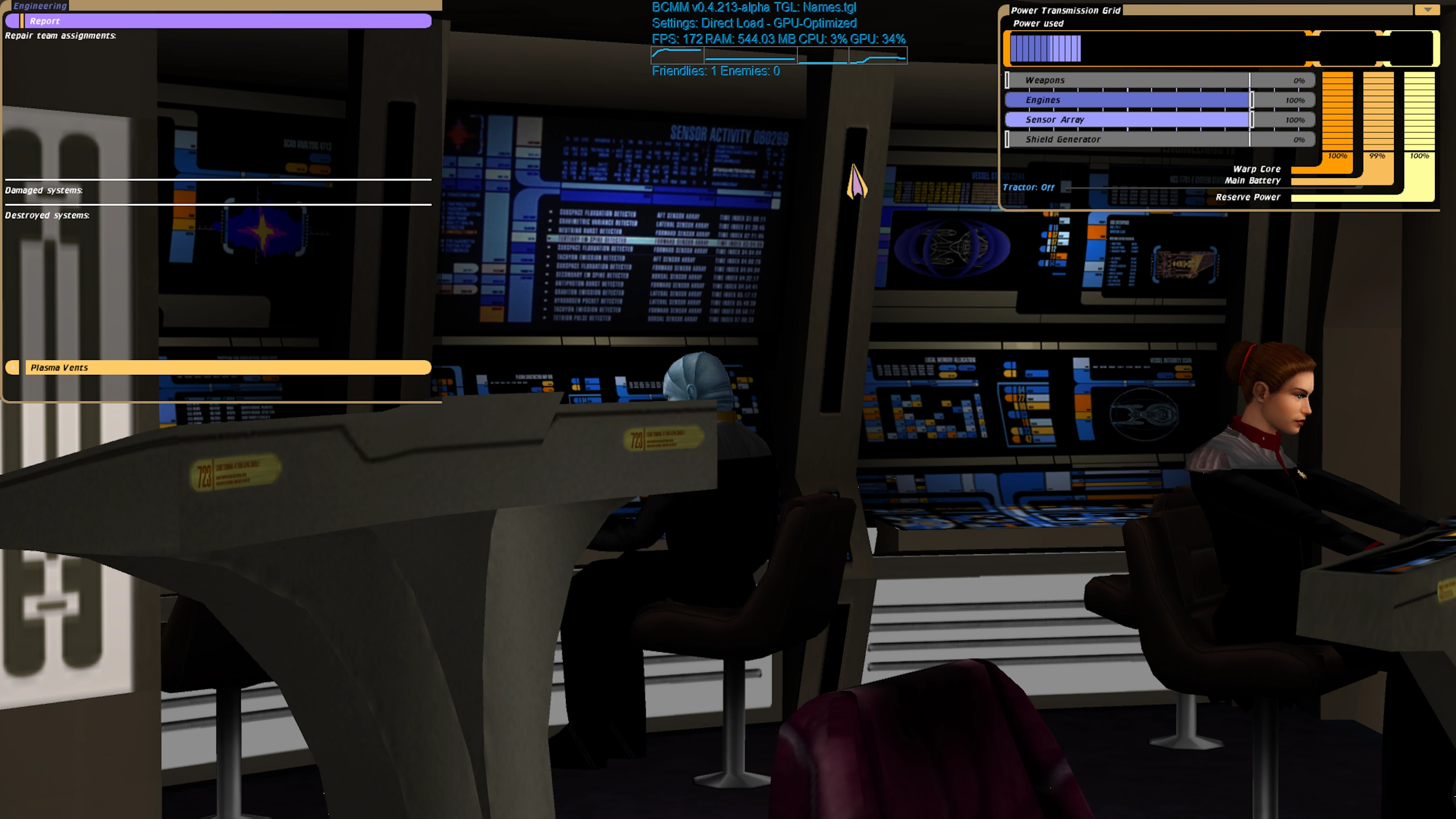
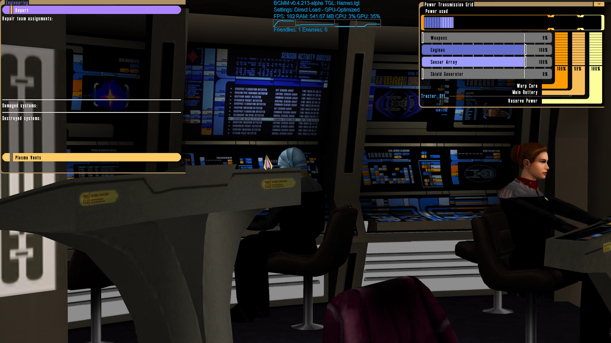
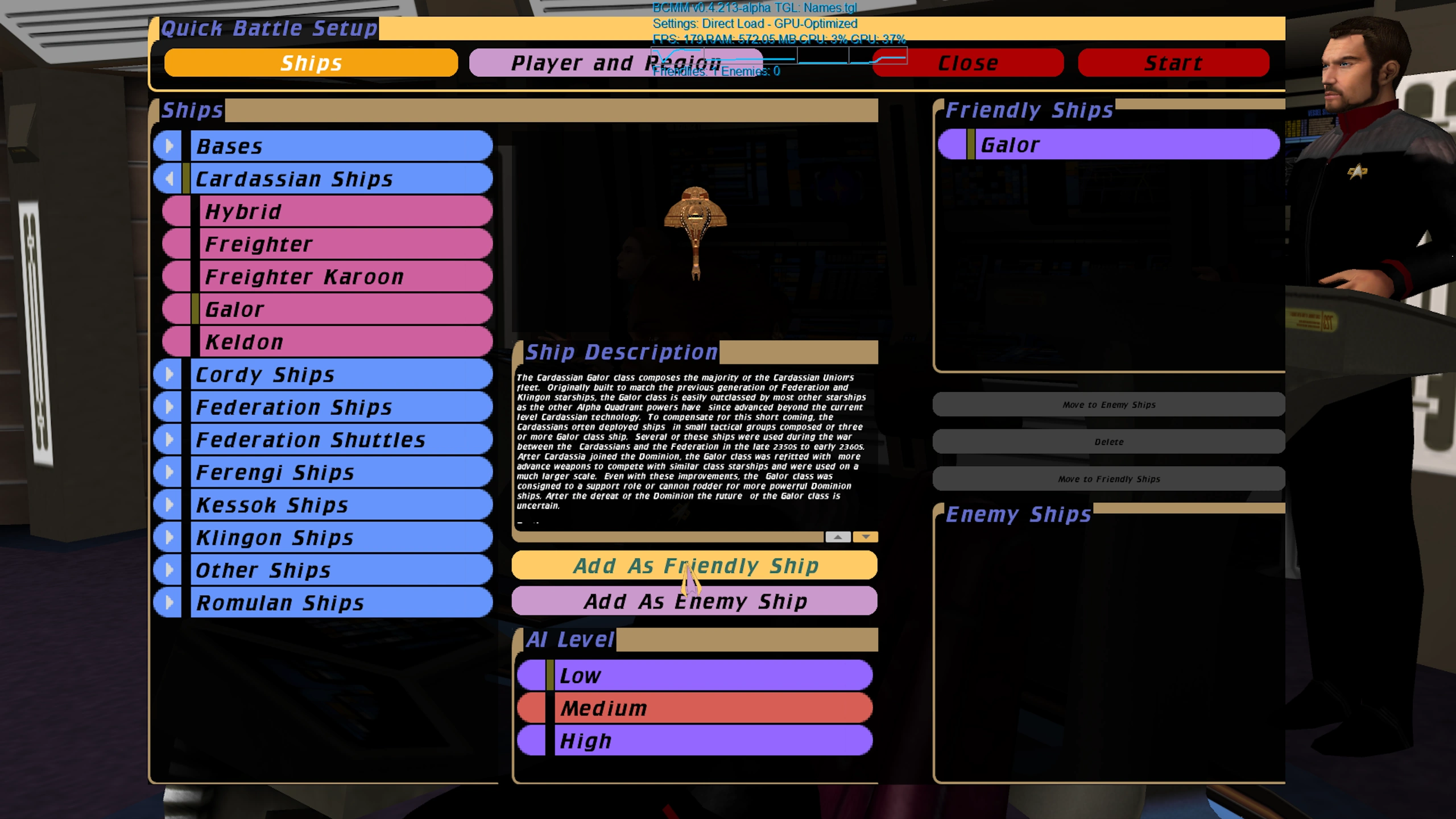
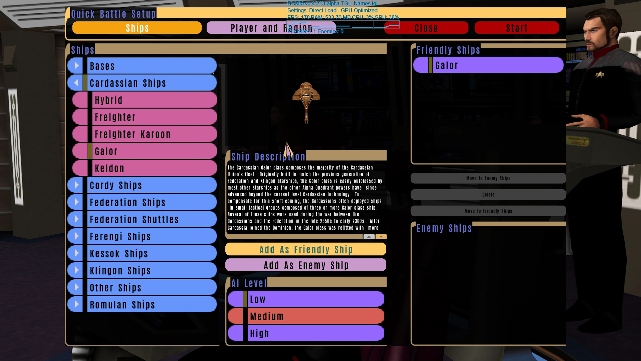
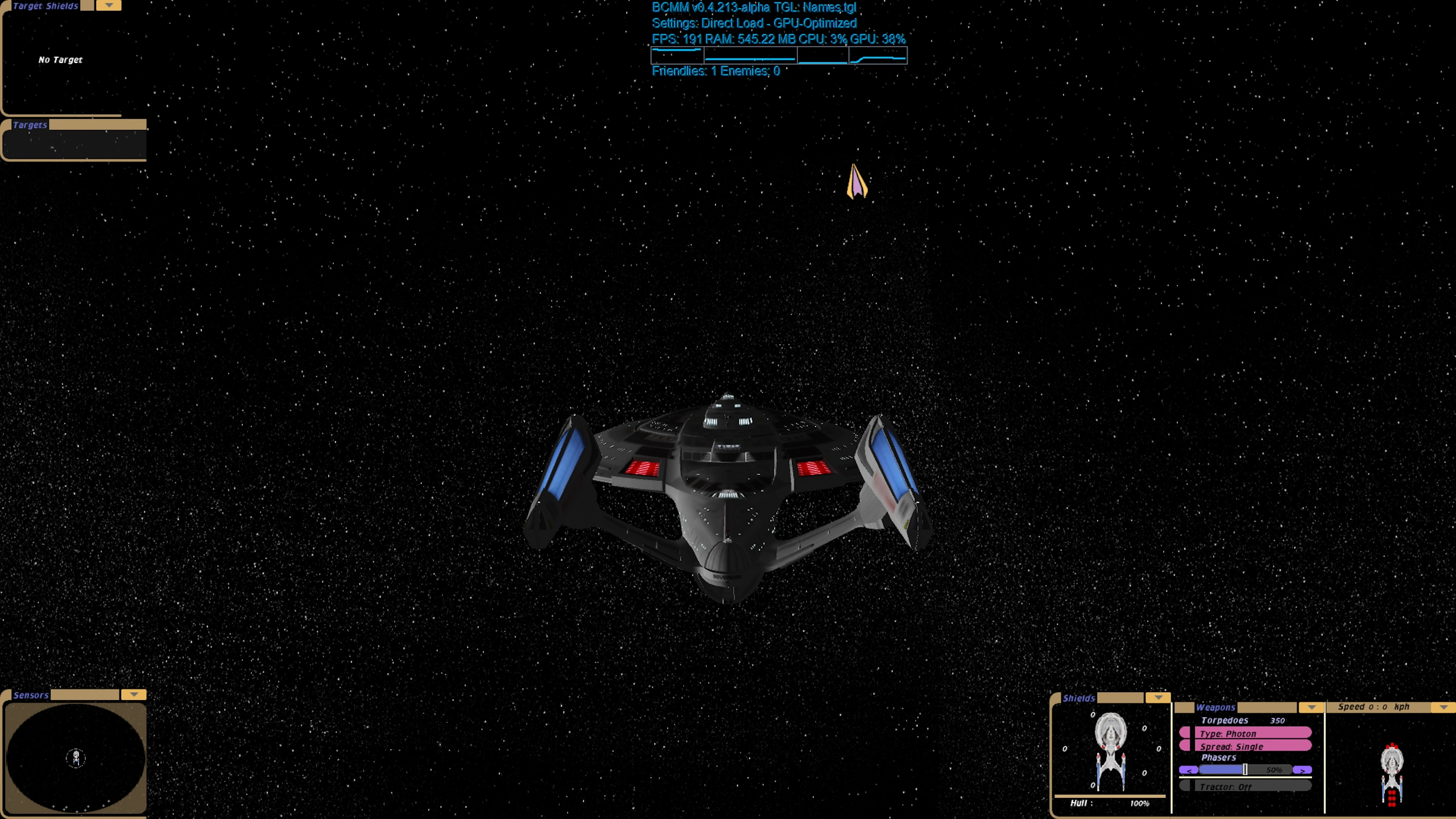
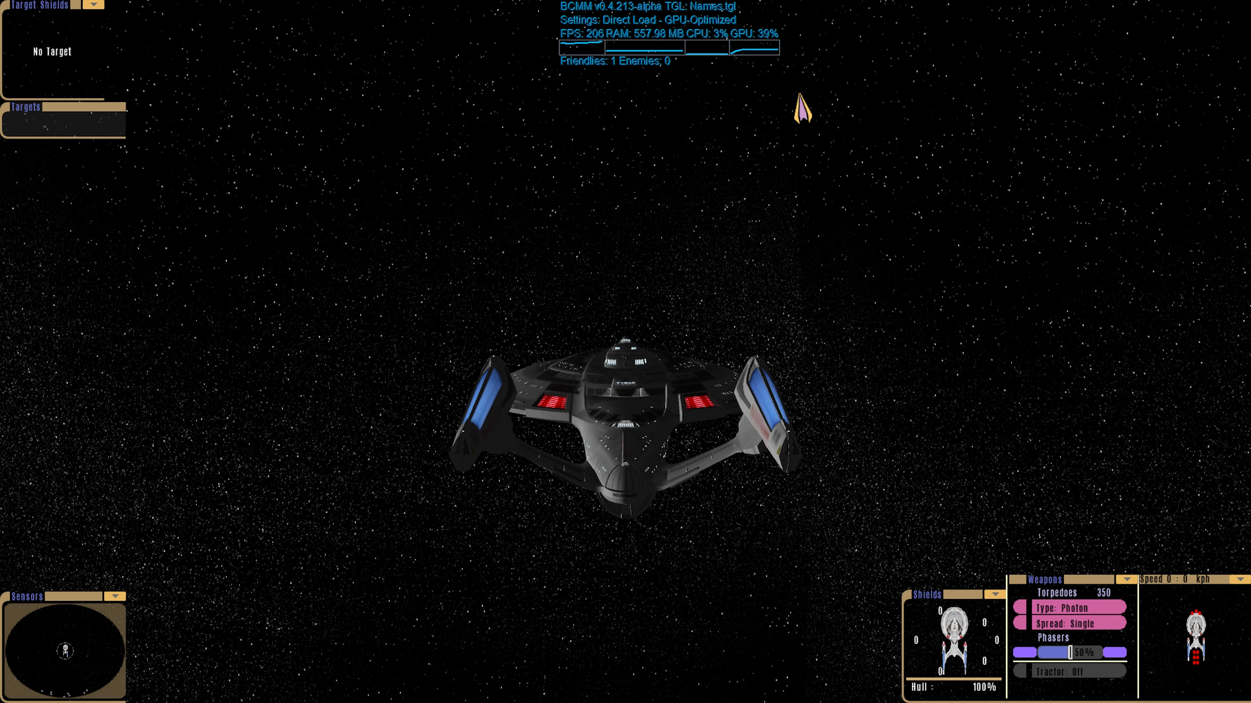
The comparisons below use the same screens, the same resolutions, and the same UI elements.
The only difference between them is the font.
Order of screenshots: Crillee, Okuda, Antonio (last).
Main Menu
Commander Menu
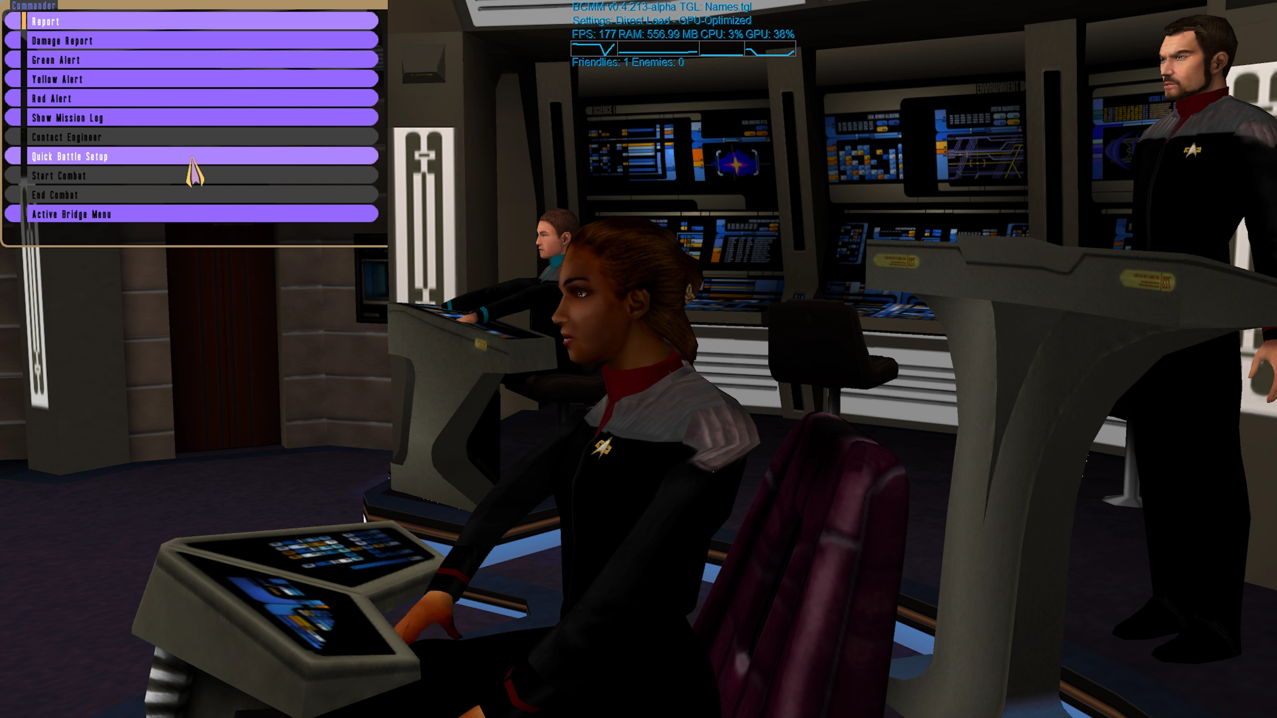
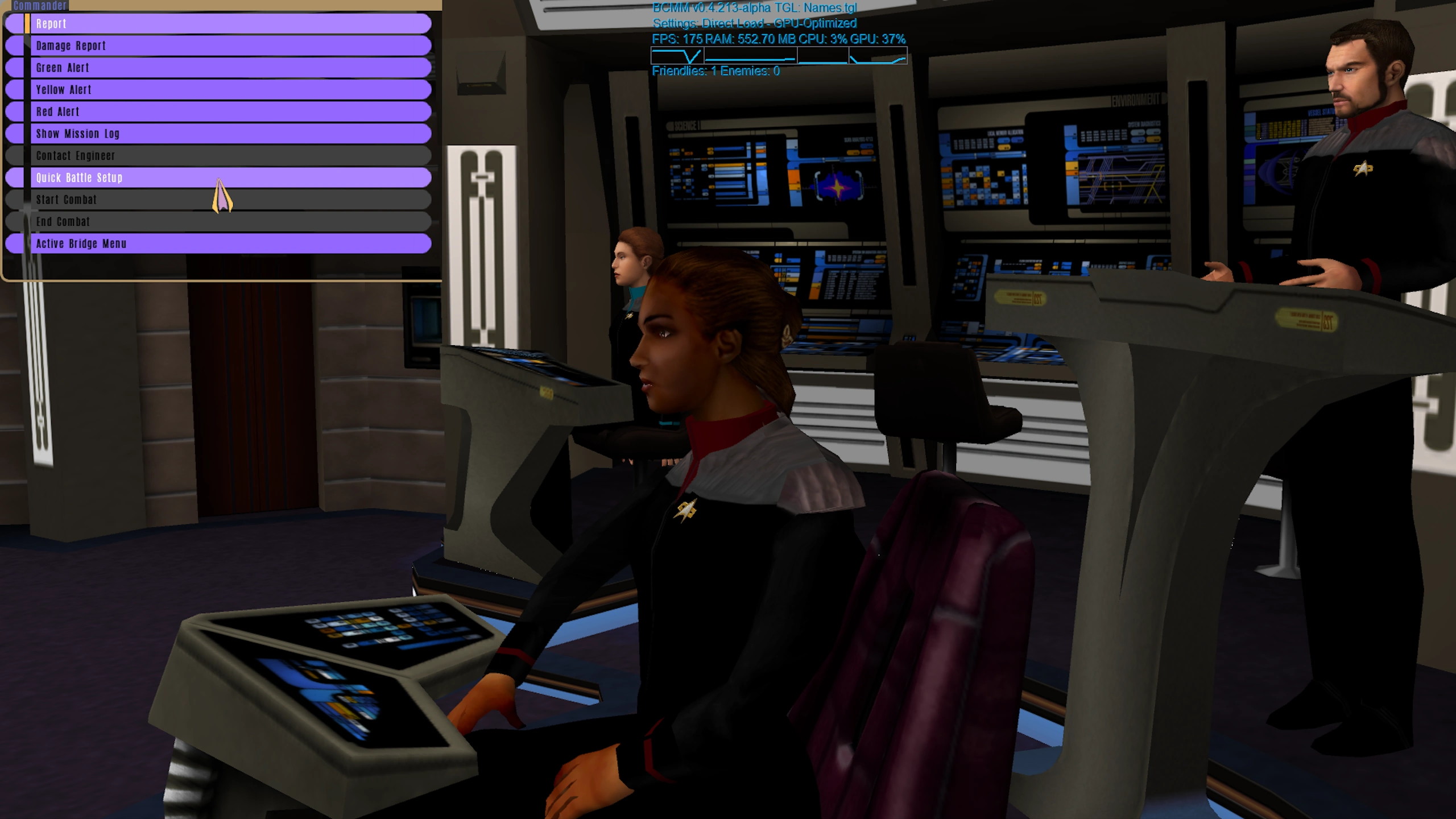
Engineer Menu

Quick Battle Menu

Tactical View

When a Mod Stops Being a Mod
There comes a point where incremental changes stop being incremental.
Not because of a single feature, but because their combined effect quietly crosses a line.
When the UI is redesigned for modern displays.
When font systems from 1999 are understood, extended, and made readable in 2026.
When long-standing community requests -- like larger, clearer text -- are solved properly, not worked around.
At that point, something changes.
BCMM no longer behaves like a traditional mod.
It behaves like a new game built on a familiar engine.
Conclusion
This may look like a small change at first glance.
But in a game where fonts had not been touched for over 20 years, this realistically marks a new era for the UI.
If your eyes say "thank you" after a long session -- the update has done its job.